State image
The state image component allows displaying an image with state-based visual cues.
Features
Configuration
This section controls the behavior of the component:
Image - the component's default image
Background Repeat - controls the repeating of the image if the component is larger than the image:
No repeat- image does not repeatRepeat- multiplies (repeats) the image both horizontally and verticallyRepeat X- multiplies (repeats) the image horizontallyRepeat Y- multiplies (repeats) the image vertically
Background Size - the handling of the background image with regard to the size of the component (default is Auto):
Auto- Displays the image without any scalingCover- Stretches the image to cover the entire componentContain- Stretches the image to fit inside the component
Background Position - controls the horizontal and vertical positioning of the background with regard to the component. The positions are in the format <Vertical> <Horizontal>
States
This section allows defining condition-based visual states for the button. These can be used to alter the look of the button based on external factors.
States variable - the runtime variable which is used to evaluate the state. The value of this variable is compared against the value of each state to decide which is the active state. If no match is found, the component will be displayed using its default values.
Test value - this is a test value that can be used to change the active state at design time. It simulates receiving the test value as the state variable value.
States - the list of defined states. Use the green button to add a new state:
State properties
Trigger - Chooses the trigger value for the state. If set to Value, the HMI will compare the value received through the States variable against the provided numeric value. If set to Variable, it will evaluate the variable value and compare it against the States variable value. If the two values are equal, the compoent will switch to this state.
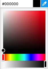
Background color - the background color of the component. A hex value can be input in one the formats:
#RRGGBB#RRGGBBAA#RGB#RGBA
Where:
R=red color componentG=green color componentB=blue color componentA=alpha (transparency) component
Alternatively, the integrated color picker can be used to visually pick a color:
Background color - the background color of the component.
Image - the background of the component.
Border color - the color used for the footer border.
Opacity - controls the transparency of the component.
The opacity and background alpha component both affect the transparency of the component, but have different behaviors. The opacity affects the whole component, while the background alpha affects only the background transparency.
Behavior - allows special behavior in the specified state:
none- no special behavior (component is rendered normally)blink- the component will blink periodicallydisabled- the component is rendered as disabled and will not respond to mouse or keyboard interactionhide- the component is completely hidden
The hide behavior is different than using an opacity of 0. A hidden component will not receive any mouse or keyboard interaction, instead any component below it will receive them. On the contrary, a component with 0 opacity (fully transparent) still exists on the layout and will receive mouse or keyboard interactions.
Style
The style properties define the default look and feel of the component (i.e. no state is active or defined).
Background color - the background color of the component. A hex value can be input in one the formats:
#RRGGBB#RRGGBBAA#RGB#RGBA
Where:
R=red color componentG=green color componentB=blue color componentA=alpha (transparency) component
Alternatively, the integrated color picker can be used to visually pick a color:
Border color - the color used for the footer border.
Shadow - allows specifying a component shadow using the built-in shadow editor:
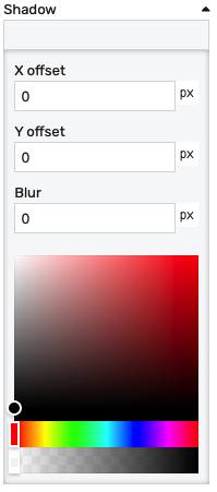
X offset- the shadow horizontal offset in pixels (can be negative)Y offset- the shadow vertical offset in pixels (can be negative)Blur- the shadow blur radius. A higher value results in a blurrier shadow, while a lower value will result in a more sharp shadow.Color picker- the shadow color
Opacity - controls the transparency of the component.
Position
The position section contains properties which affect the position and size of the component. These can be changed by dragging and resizing the component with the mouse, or directly, by manually entering the values:
Left - distance from the left edge in pixels
Top - distance from the top edge in pixels
Width - component width in pixels
Height - component height in pixels
Layout
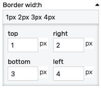
Border width - controls the width of the border on each side. Values can be manually input as:
<top>px <right>px <bottom>px <left>px<top_bottom>px <left_right>px<all>px
Alternatively, the built-in border editor can be used for a visual input:
Padding: Distance from the border to the inner contents in pixels.
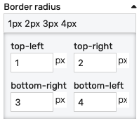
Border radius: Border radius for the border corners. Values can be manually input as:
<top-left>px <top-right>px <bottom-left>px <bottom-right>px<left>px <right>px<all>px
Alternatively, the built-in border radius editor can be used for a visual input:
Placement
The placement section controls the placement and stretching of the chart:
Placement - the placement of the chart:
Absolute- the component will have fixed coordinates and sizeStretch horizontal- uses fixed vertical position and stretches the chart horizontallyStretch vertical- uses fixed horizontal position and stretches the chart verticallyStretch- stretches the chart both horizontally and verticallyPin left- pins the chart to the left of the page, while keeping its sizePin middle- pins the chart to the middle of the page, while keeping its sizePin right- pins the chart to the right of the page, while keeping its sizePin top- pins the chart to the top of the page, while keeping its sizePin bottom- pins the chart to the bottom of the page, while keeping its size
Offset left - the left offset when using any placement except Absolute
Offset top - the top offset when using any placement except Absolute
Offset bottom - the bottom offset when using any placement except Absolute
Offset right - the right offset when using any placement except Absolute